This assignment focuses on searching for and identifying certain styles in art that took place during movements throughout the history of graphic design. These are a few examples that I found around town and in Nashville.
VICTORIAN --->
Many of you will recognize that as a building at Fisk University. This is not the original picture that I took, because the quality wasn't good enough to see the important details, and I wasn't able to fix it in photoshop. However, that does not take away from how relevant this building is to acknowledging Victorian architecture. It is castle-esque, with many windows and curvilinear structures on the outside. The bell tower is by far the most prominent Victorian design element, with it's rustic shape and exterior context.
<--- ARTS & CRAFTS
This is a picture of a book I found at my friend's house... his mom collects old book reproductions, because few of us have enough money to get our hands on the real thing. Aside, this is a wonderful example of A&C book page and text design. It's busy organic vine-like shapes and structures are your classic Arts & Crafts standard, with a recognizable Gothic look and feel. Even the title of the page seems to agree with that statement.
ART DECO --->
You guessed it! It's the Regal Cinema at 100 Oaks! This brilliant work of neon art screams art deco. It's futuristic structure is hideous to the point of not being able to take your eyes off of it. It is retro and spunky, just like most art deco architecture, and I was NOT going to pass up a chance to get this gem worked into my blog.
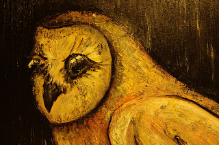
<---EARLY MODERN: EXPRESSIONISM
Voila! I present to thee my take on Van Gogh's wonderful expressionist style, in the form of a barn owl. His use of bold color and emotionally charged brush strokes and shading has always been an inspiration to me. While this photograph isn't worth a thousand words, I must say that this style (as seen in my painting) is pretty close to that which he used in self portraits and in many sunflower paintings.
This is an example of Van Gogh's work that is similar to what I've displayed above.
And finally we arrive at ART NOUVEAU --->
This is a bird silhouette mobile that I have hanging from a lamp in my room. As you know, birds and silhouettes were extremely popular motifs during the art nouveau movement... so I figured that a combination of the two would make a great example. Once again, organic forms and nature are big influences on art, and they come together wonderfully, as seen here. While it is true that this is perhaps a more modern take on art nouveau, it is still a pretty darn good example if you ask me.
Sunday, October 10, 2010
GOOGLE DOODLE REALLY HONORS ARTISTS
As You probably know, Google Doodle is both a competition for artists to have their work published on one of the grandest homepages ever AND a reminder for many as to the holiday or famous dead-person's birthday. Google artists really get creative in order to incorporate their logo into a work of art that represents the "theme of the day". And they usually do a really good job. Some logos are simply images, while others are interactive, videos, or gif files.
Today I am going to focus on the logos that have been designed for famous historic artists, many of which we have studied in class. Above you will see "The Scream" by Vincent Van Gogh, who is not honored in one but two well known logos, including "Starry Night." Van Gogh based his art strongly on the principles of expressionism, using swirling bold lines of color to convey emotion rather than portray reality.
I have also included a design based on Salvador Dali and his work "The Persistence of Memories". His surrealist style is mimicked in the logo, cleverly interpreting the clocks in the original piece as the o's in Google.
Yet another artist, Pablo Picasso, has been targeted by Google artists. Here they have used Picasso's famous method of cubism to distort faces and body parts in a stylized effort to describe his work... and they succeeded. Notice the trademark 2-perspective faces.
And last, but certainly not least, we have-- you guessed it-- Leonardo DaVinci. This artistic mastermind's most memorable work can be seen here. He was as realistic in his work as one can get, and he will always be remembered and honored as one of the most prestigious artistic geniuses to have ever walked the earth.
So there you have it. 5 brilliant examples of good-old Google Doodle art, all dedicated to a handful of the greatest artists of all time. Cheers!
Monday, October 4, 2010
CRAZY PEOPLE = INSANE WATCHES... RIGHT?
Okay. Watches are pretty much the stuff if you ask me. Especially the ones that don't even look or really even act as watches... I mean, who the heck came up with these things? Really? You thought "hey this would be a neat idea for a watch" and actually made it happen? YOU FREAKS! YOU'RE AWESOME!
Think I'm kidding about the insanity behind the design behind high tech watches? Then check this out:
And here we see the Samsung Proxima in all its glory. This crazy thing is a computer, GPS, and WiFi hot-spot all in one convenient watch disguise. The complexity behind this concept is almost impossible to put into words given this situation.
...You just take it off the watchband, download all you crap onto it, put it back on, and look like a cyborg genius with a totally sick watch... thing. Please just click on the image, I'm clearly doing a horrible job of describing this.
Meet the Jourmugand. The concept behind this watch is from Norse mythology. Jormungand is a serpent that is large enough to encircle the earth and hold onto his own tail. As the story goes, when he lets go of his own tail the earth will end. The story in itself is fantastic, but its application to the watch design is astounding.
The face looks like a pie chart with a small sliver cut away. This sliver emits a bright white light that can be seen in broad daylight. As time passes, the face turns clockwise, with the illuminate sliver indicating the time. And it makes an efficient night light.
And last but not least, the Moon Watch... with the pun very much intended. The wearer could be completely oblivious to the outside world, but would always know what cycle and stage the moon is on.
The idea behind this is really interesting and creative, regardless of the fact that this is a very simple and expected idea. The designer here played their cards very well.
Think I'm kidding about the insanity behind the design behind high tech watches? Then check this out:
This is "TIWE." TIWE is an OLED watch... the white round dots float around randomly, and when you want to know what's the time you can just shake it or tap the glass.
How cool is that?
I would totally want this watch. Who doesn't want a watch that is constantly animated and obscure until you want to know the time? Its the future of ADD distraction!
The concept here is genius. The design is brilliant. Just look at it... it's original and fantastic, unlike anything we've ever seen before. It's a serious upgrade from the flashing LED background watches that premiered in the early 2000's.
And here we see the Samsung Proxima in all its glory. This crazy thing is a computer, GPS, and WiFi hot-spot all in one convenient watch disguise. The complexity behind this concept is almost impossible to put into words given this situation.
...You just take it off the watchband, download all you crap onto it, put it back on, and look like a cyborg genius with a totally sick watch... thing. Please just click on the image, I'm clearly doing a horrible job of describing this.
Meet the Jourmugand. The concept behind this watch is from Norse mythology. Jormungand is a serpent that is large enough to encircle the earth and hold onto his own tail. As the story goes, when he lets go of his own tail the earth will end. The story in itself is fantastic, but its application to the watch design is astounding.
The face looks like a pie chart with a small sliver cut away. This sliver emits a bright white light that can be seen in broad daylight. As time passes, the face turns clockwise, with the illuminate sliver indicating the time. And it makes an efficient night light.
And last but not least, the Moon Watch... with the pun very much intended. The wearer could be completely oblivious to the outside world, but would always know what cycle and stage the moon is on.
The idea behind this is really interesting and creative, regardless of the fact that this is a very simple and expected idea. The designer here played their cards very well.
For more amazing and innovative watch designs, visit: blogof.francescomugnai.com/2010/08/watches-design-concept-have-never-been-this-interesting/
MEET GLEN JONES... DESIGN GENIUS EXTRODINAIRE
This is the work of Glen Jones. It goes without saying that he is a design genius... he takes everyday things, people, objects, concepts, and myths and turns them into highly stylized pictures that will blow your mind. They are simple, flat geometric planes of color that depict comical stories and situations. These examples are just a few of my favorites, you can see more on his totally awesome website:
http://digitalartempire.com/2010/04/209-stunning-and-hilarious-illustrator-designs-by-glenn-jones/
His sheer brilliance it truly astounding. I would love to buy every single one of his prints, frame them, and hang them on every square inch of my room. Who wouldn't? There's not too much I can say, his images just speak for themselves. Please visit his website and let your eyes indulge. Kudos, Glen Jones, you are my artistic hero.
Subscribe to:
Posts (Atom)